
Ada Symptom Checker Whatsapp Intergration
Designing accessible, low-friction digital health screening within real public-health constraints
Project Scope
The project focused on designing and testing a WhatsApp-based symptom checker to support early health screening, triage, and referral through accessible, low-data conversational interfaces.
Outcome
The work resulted in a validated prototype and UX insights that demonstrated how conversational design and simplified flows could reduce friction, improve comprehension, and increase user confidence in digital health screening tools.
Role
Lead Research & UX Strategist

The Challenge
Many people rely on WhatsApp as their primary digital interface, yet health screening tools are often designed with assumptions of high digital literacy, medical familiarity, and uninterrupted attention. The challenge was to design a symptom checker that could operate within the constraints of conversational messaging while remaining accurate, culturally appropriate, and easy to complete without overwhelming users or increasing drop-off in a high-stakes public health context.
The Approach
I led a human-centred, behaviourally informed UX approach that translated complex clinical screening into a simple, conversational WhatsApp experience through continuous user testing and close collaboration with public health stakeholders.
Human-Centred Discovery and Context Mapping
Grounded the design in real user behaviours, language patterns, and health-seeking realities by observing how people naturally use WhatsApp for information, support, and decision-making in low-resource and high-stress contexts.
Conversational UX Design for WhatsApp
Translated clinical symptom screening into short, sequential, plain-language prompts that fit naturally into chat interactions, reducing cognitive load and avoiding medical jargon.
Progressive Disclosure of Questions
Structured the flow to reveal one question at a time, allowing users to focus, respond confidently, and feel guided rather than interrogated during the assessment.
Rapid Prototyping and Live User Testing
Built and tested early prototypes directly within WhatsApp-like environments to observe friction points, misunderstandings, and drop-off moments in real time.
Iterative Refinement with Health Stakeholders
Worked closely with public health and clinical teams to balance usability with diagnostic integrity, ensuring the tool remained both user-friendly and medically responsible.
The Solution
A WhatsApp-native symptom checker that provides accessible early triage and clear care guidance, enabling users to move from uncertainty to informed action within a familiar, low-barrier digital. environment.
A WhatsApp-native symptom checker that functions as a trusted first point of contact for health concerns.
An accessible early triage tool that enables users to assess symptoms and understand risk levels without requiring medical literacy or data-heavy platforms.
A decision-support layer that provides clear, contextual guidance on when and where to seek care, reducing uncertainty and delay.
A low-barrier referral pathway connecting users to appropriate health services in a way that feels private, discreet, and manageable.
A scalable digital health component designed as a modular building block that can be adapted across conditions, regions, and public health programmes.
The Evidence
Context Setting
MomConnect is a voluntary WhatsApp-based programme supporting mothers during pregnancy and early childhood. By integrating the clinically validated Ada symptom assessment tool, the initiative enables pregnant women and new mothers to privately pre-screen for health concerns and receive care guidance through a familiar, low-data channel. The work focused on prototyping, piloting, and iterating the integration to ensure a seamless, scalable health screening experience aligned with public health needs.
.png)
Discovery Challenge
Because the Symptom Checker could not be surfaced directly in the main MomConnect menu without disrupting ongoing research studies, discoverability became a key challenge. The work focused on designing alternative, low-friction entry points within existing conversation flows so that users could naturally encounter and access the tool without altering core programme behaviour or biasing research outcomes.
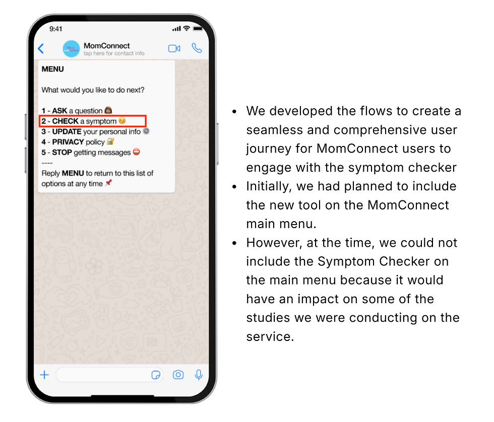.png)
Alternative Entry
To address the discoverability constraint, an alternative entry point was designed by embedding the Symptom Checker within existing post-clinic and educational message flows. Users who actively engaged with core MomConnect content were gently introduced to the tool at relevant moments in their pregnancy journey, allowing exposure to the symptom checker in a contextual, non-disruptive way that aligned with behavioural patterns and programme safeguards.
.png)
User Testing
We planned to carry out in-person user testing with registered MomConnect users at clinics in Johannesburg, South Africa, but were not granted permission. Instead, myself and the Service & Design team recruited 10 women fitting the MomConnect user profile from our personal social networks, ensuring a range of feedback from women who had not previously been registered on MomConnect, were either pregnant or mothers, and were located in Johannesburg, Cape Town, and Eswatini.
.png)
UX Improvements
User feedback revealed that many participants were unaware that the assessment would generate a downloadable PDF, creating confusion and drop-offs when results were delivered. To address this, a clear expectation-setting line was added to the introductory message, informing users upfront that a PDF reader is required, reducing friction, improving preparedness, and aligning the experience with users’ device capabilities and digital contexts.
.png)
Language Improvements
User testing revealed that abstract system commands such as “EXPLAIN” were frequently overlooked or misunderstood, particularly within the constraints of a WhatsApp and USSD-style interface where keyboard visibility and message order affect attention. In response, the language was redesigned to reflect natural, everyday phrasing, replacing system-driven prompts with plain, self-expressive statements like “I don’t understand what this means”, making help-seeking intuitive, visible, and accessible for users with varying levels of digital literacy.
.png)
The Impact
Drop-Offs During Assessment Completion
↓
Successful Result Access
↑
Task Completion Confidence
↑
Improved UX Clarity
↑
Personal Reflection
Designing With Care
This project marked a formative moment in my practice, shaping how I think about design, responsibility, and collaboration in complex public health systems. Working at the intersection of UX, clinical realities, and national digital infrastructure taught me that good design is rarely about ideal conditions; it is about adapting thoughtfully within constraints while still protecting the user experience. Navigating limitations around clinical access pushed me to think creatively about research and testing, reinforcing the importance of pragmatism without compromising rigour. Most importantly, the project grounded my design approach in humility: small decisions in language, flow, or layout can materially affect whether someone completes an assessment or disengages, and in public health contexts, those moments carry real human consequences.
